IFComp 2007: The Lost dimension
 Comments(2)
 Next we have a text-based RPG with an experimental GUI. Spoilers follow the break.
I’m going to spend nearly all of this post critiquing the GUI, because it’s clearly the developer’s focus. (And I use the word “developer” rather than “author” for a reason.) According to the game’s introduction, “The GUI interface made it suitable for beginners to play. It is also my hope that the GUI interface would attract those who normally don’t play text adventure games.” Maybe that’s true, as far as it goes, but in the context of the comp, it’s also irrelevant. There’s no one here who’s afraid of a command prompt, and since we’ve already made a commitment to judging the games, attracting us is not a problem. Retaining us is another matter.
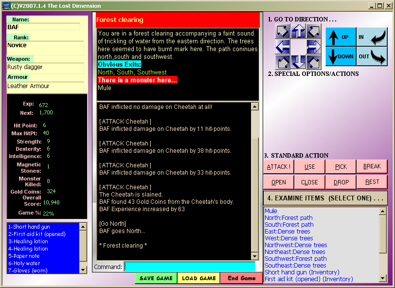 A first look at the interface shows that it was designed according to coloring-book principles: pink action buttons, white-on-blue inventory, a brilliant cyan command prompt, a purple-and-white diagonal gradient background, etc. There’s a place in well-designed interfaces for varying the color scheme, but not like this. Color is best used to make elements stand out. There’s a good example of this on the left-hand side, where the character stats are in a different color from their names, allowing the user to easily isolate the important information at a glance. But just above that, we see the opposite effect: the player’s equipment is allowed to blend into the background while the names of the equipment slots are highlighted. It’s all rather haphazard.
The developer has tried to make some accomodation for people who prefer a command-line interface. Now, I have nothing against GUIs — I frequently play graphic adventures, which are GUI by their very nature. But when you’re dealing with text, I find that CLI are usually easier to use. GUIs are usually easier to learn — all of your options are there in front of you, and thus easily discoverable without reading docs. So even in dealing with textual data, a GUI can be preferable for things you do infrequently. The main strength of a CLI that it doesn’t require constant visual feedback. Typing commands means that any back-and-forthing between user and machine happens at the highest possible level: you say what you want, the computer generates a response. So I was initially pleased that the game supported a command prompt. Then I tried it, and realized that it makes the sort of interaction I just described impossible. Instead of letting the user enter a complete command, it only accepts the verb: if you want to get an object, you type “get” and a dialog box with a list of items immediately pops up. You can then select an item from the menu by typing a number. Even worse, if you want to examine something, the box pops up after you type “exam” — the common adventure-game abbreviation “x” is not recognized — leaving you typing “ine” into the number prompt out of momentum. But that’s tangential to my point here, which is that if you want to use the keyboard, you’re expected to awkwardly consult the user interface for more information in the middle of a command. Well, if I’m going to be selecting things from menus all the time, I might as well just use the GUI. But even the GUI is affected adversely by the presence of the CLI: all keyboard events go to the command prompt (not even clicking outside the prompt shifts the focus), so there’s no possibility of keyboard shortcuts for UI elements. 1 The screenshot provided here actually underlines characters in the action buttons as if to indicate shortcut keys, but that seems to be an artifact of the way Windows does screenshots. In actual play, the underlining isn’t even visible, let alone functional.
Ultimately, putting a GUI in front of something isn’t a magic bullet to making it easier to use. A well-designed GUI can make things easier, but GUIs are surprisingly hard to design well. Take movement. The GUI element for movement here is a compass rose made of buttons with arrows on them. This isn’t the first text-based game with a GUI I’ve seen, and nearly all such games have some kind of clickable compass rose for entring movement commands. There are even games that have a compass rose as their sole GUI element. And I don’t think it ever works well. To the developer, it’s the obvious way to handle directional movement, but speaking as a player, it just feels wrong to have these graphical directions in a void of reference. It’s easier for me to accept something more abstract (moving by typing commands) or more concrete (moving by clicking a destination on a map or illustration). But note that a clickable compass rose that greys out blocked directions effectively becomes a map for the current location — and in such cases, I tend to use it as a map, but still don’t click on it if I have a choice.
But enough. Let’s talk about the content a little. At root, this is a game about randomized combat. I didn’t finish the game during my judging period, so there may be subtleties beyond what I saw — I never found (or looked for) a use for the “break” command, and have no idea what the “intelligence” stat affects — but what I saw was mainly fighting monsters, enhancing my stats and getting better equipment to fight monsters, and healing up after fighting monsters. Everything else was just mapping and clicking through all the objects in the “examine” menu. Reading the room descriptions seemed to be completely optional, and didn’t add much to the experience. Monsters vary a lot in name (“brainless zombie”, “white ape”, “abyss ant”), but they’re basically all the same thing at different strengths. There’s a premise involving the Bermuda Triangle, and a goal involving five “magnetic stones” that will send you back home. The fact that the setting is modern but still includes “leather armor” as an item says a lot. In short, even ignoring the interface, I’m unimpressed.
Rating: 2
| ↑1 | The screenshot provided here actually underlines characters in the action buttons as if to indicate shortcut keys, but that seems to be an artifact of the way Windows does screenshots. In actual play, the underlining isn’t even visible, let alone functional. |
|---|
Regarding underlines: these days, Windows hides keyboard shortcuts. What happens when you press Ctrl?
Ctrl by itself does nothing. Ctrl plus one of the letters underlined in the screenshot produces the system “default beep” sound, but has no other effect.
Alt, however, makes the underlines appear, and pressing the letter with alt held down produces the action. So it is possible after all! Although it’s a bit unconventional that you have to keep alt held down. Releasing alt and pressing a letter just produces the “default beep”, even though the underlines are still visible at that point. In fact, it looks like the underlines don’t ever go away once they appear, no matter what you do.
(Also, come to think of it, this explains why the underlines appear in the screenshot: I used Alt-Print Scrn to grab just the one window, and the GUI reacted to the alt.)