PQ4: UI
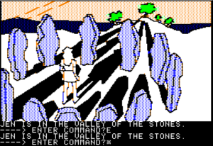
Most of Sierra’s adventure games used standardized UIs, but the standards went through several iterations. The very earliest Sierra adventure games were illustrated text adventures, where all interaction went through a text parser, and the graphics could be turned off at will. King’s Quest introduced the AGI engine, which added interactivity to the illustrations through an on-screen avatar that you moved around with the arrow keys or a joystick, and this marked the beginning of what we tend to think of at the Sierra-style game today. But it wasn’t until King’s Quest IV, the first game to use the SCI engine, that they added mouse support, and even then, the text parser remained the primary way of entering commands. Only with King’s Quest V did they start making true “point-and-click adventures” — a few years after their chief rival, Lucasarts (then known as Lucasfilm Games). This was basically the final standard Sierra interface, and this is the stage at which Police Quest 4 was made.
Now, the Lucasarts UI at that point was basically a menu for building text commands. You had a menu of verbs at the bottom of the screen, and the nouns were provided by clicking on objects in the scene or in your inventory. Sierra’s approach was different: instead of textual verbs, there were icons. Click on an icon, and it changes the cursor. The icons varied from game to game, but typically included a walking-legs icon for “go to”, an eye for “examine”, and a hand for a general “use/manipulate/pick up”. The last is something that Lucasarts games would split into multiple verbs, allowing the player to specify what they wanted to do more precisely. With the Sierra version, I often don’t know what effect clicking the hand on something is going to produce. Click the hand on a person, and, depending on context, it might be interpreted as an attempt to shake their hand, or to push them aside, or grope them, or tickle them. (In the course of playing PQ4, I’ve encountered all of these.) Lucasarts experimented with their own version of a body-part-oriented action menu in Full Throttle, and it had pretty much the same problem. If it is a problem — there’s something to be said for a game that surprises you, and Coktel’s Goblins series made a virtue of it by making it pretty much the point of the game.
These icons aren’t the only verbs, though. Inventory items are also verbs. That might seem strange if you’re unfamiliar with the kind of UI I’m describing, but what I mean is that they can be assigned to the cursor just like the action icons, effectively creating the verb phrase “Use [object] with…” Now, one big difference between the Sierra point-and-click UI and the Lucasarts one is that Sierra made verbs into modes. Once you assign an action to the cursor, it stays there until you change it. This, combined with the obtuseness of some of the puzzles, yielded the “use every item on every other item” syndrome. If you have an apple in your hand, and you don’t know what it’s for, it’s easy to just go around clicking it on everything until something happens. I really haven’t had a problem with this in PQ4, though, perhaps because the use of objects in this environment tends to be obvious. I have a gun and a badge, but when I get stuck, I’m pretty sure it isn’t because I haven’t applied them to the right inanimate objects.
One other thing about the Sierra UI from King’s Quest V onward: it was designed with full-screen graphics in mind. In KQ5, the icons were hidden until you moved the mouse to where they were located, along the top of the screen. (PQ4 puts its action icons at the bottom.) In KQ5, this had the effect that anything in the top inch or so of any scene had to be purely decorative, because there was no way to click on it: if you moved the mouse cursor there, it would be immediately covered up with action icons. Now, by PQ4, they had come up with a way around this: the icons only appear when you move the cursor all the way to the bottom edge. But at the same time, PQ4 makes such measures unnecessary by not using that part of the screen after all! The scene takes up only part of the screen, making a sort of pseudo-letterboxed effect; at the bottom, when the icons aren’t visible, their place is taken by filler, the words “Police Quest” in big letters on a crude stone-effect background. They might as well leave the interface there all the time — and in fact they give the player that option: you can “lock” the UI in place. But why not just make it that way automatically? It smells of compromise between opposing design goals, or perhaps code reuse with unintended consequences.
 Comments(0)