Games Interactive: Main Menu

gi-main
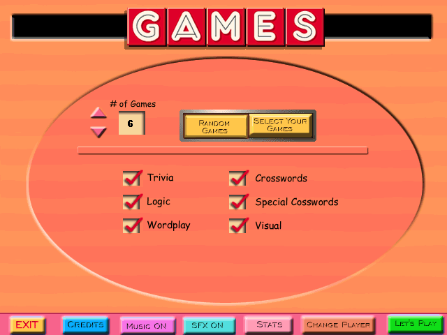
So, let’s get right to it. This horse isn’t getting any deader. My criticism of Games Interactive, a work that no one cares about, begins at the main menu, which starts with a transition animation that’s out of sync with its sound effects. When I first played the game, I figured this was a symptom of my machine being too slow, but no, that’s just how it is. But that’s a trivial matter. The greater problem is that the whole design of the main menu is completely at odds with the game’s content.

There are a lot of puzzle games that let you pick individual puzzles out of a menu, and in most cases, their selection menus work pretty much the same way. You’re shown a bunch of levels, usually as names in a list or icons in a grid. You select one of them and the puzzle starts. When you’re finished with the puzzle, the game sends you either back to the selection menu or directly to the next puzzle in sequence. This is all fairly natural and intuitive, but it’s too simple for the makers of Games Interactive. Instead, you start with a menu that lets you choose a number of puzzles from 1 to 15, and whether you want to pick them from a list or let the game pick them at random. If you choose to pick them yourself, you go to a list where you check off as many checkboxes as you said you wanted puzzles, then press a “play” button to solve them in sequence. If you choose randomization, you can narrow the selection down by broad categories such as “Trivia”, “Logic”, and “Crossword”.

The default setting, which the menu reverts to on every visit, is to play six puzzles chosen at random from all categories. It’s inconceivable to me that anyone would actually want this. For one thing, I don’t see why you’d commit to solving six puzzles in a row instead of asking for one puzzle, solving it, and then seeing if you’re still in the mood for another. But even choosing one randomly-chosen puzzle is questionable. Sure, I can appreciate wanting a surprise, but it doesn’t exclude puzzles that you’ve already solved, and solving puzzles twice isn’t how puzzle games work. Also, there’s a great deal of variability in the size and length of these puzzles. Some are sets of trivia questions, which you just answer right or wrong, one after another, and finish with in a couple of minutes. Others are 25×25 “World’s Most Ornery” crossword puzzles, or entire collections of multiple Picross puzzles. Asking for six random puzzles is basically saying “I want to commit to a session lasting somewhere between fifteen minutes to several hours.”

In short, whoever designed this menu seems to have had a very different sort of game in mind, one composed of units that are uniformly bite-sized and replayable. The puzzles here are heterogeneous, and replayability is never a strong feature of puzzles. This is just one way that the makers of this game failed to handle their material well. I’ll describe more soon.

Dark Fall: UI

There’s a clunkiness to interacting with Dark Fall. It’s mostly just the clunkiness endemic to Macromedia Director mystlikes, of waving the cursor around to look for hotspots, and of not being sure whether clicking on a journal page will turn the page or close the journal. But it’s also got some clunkiness all its own as well.

Mainly it’s about hotspots going away. Let’s say you find a desk. You click on the desk and it goes to a close-up view from which you see a drawer. Click on the drawer and it opens, without leaving that view. When you’re finished looking in the drawer, you might try to back out to the main view of the room, only to discover that you can’t. As long as the drawer is open, the hotspot to leave the desk is gone. You have to close the drawer first. Most games of this sort would let you back out and, as a consequence, close the drawer automatically (by forgetting that it was open). Even weirder, there’s one close-up view I’ve seen where there are two drawers visible, and you can only open one at a time. If you open the left drawer, you have to close it in order to open the right drawer.

It makes it seem like most things are modeled simply as a graph. Moving from place to place in an adventure game usually means moving between nodes of a graph, and in a first-person game with discrete and unmoving camera positions, each camera position is a node on a graph, including the close-up view of the desk. But here, opening a drawer or examining a newspaper also moves you to a new node on the same graph, no different from walking into another room. Not everything is modeled this way; there exist a few machines and combination locks with multiple twiddlable controls. But they’re pretty sparse.

One other peculiar thing about the UI: its treatment of inventory. There is some small number of inventory items displayed at the top of the screen, which I suppose means it’s not a pure mystlike, but then, neither was Myst by that standard. And there are environmental objects that are clearly flagged as things you use inventory items on — when the cursor is over them, it changes into a stylized wrench. But the UI doesn’t support clicking on that wrench area with an inventory item. Instead, you just click on an item in your inventory, and if it has a use from your current camera position, it will be used. The wrench cursor looks like it’s a hotspot highlight, but it’s not. Perhaps this is another example of the graph-node mindset. Even the inventory is treated as links you can click on to transition to a different node.

Vice City: Awkwardness Revisited

Well, I’ve made it off the initial island. As in GTA3, progress from one part of the city to another is arbitrarily gated by missions: the ostensible reason you can’t use the bridges just happens to go away the moment you have an in-story reason to be on the other side. Also as in GTA3, the first island’s climactic mission is the one that introduces a gun that you can aim and fire in first-person mode, which is a great deal easier to do with a mouse than with a gamepad. Having been through this situation once, I did not long hesitate to put my controller down.

Using the mouse for first-person aiming makes things easier, but I have to ask: does it improve the experience of the game? I think it does in this instance, because the mission is frustratingly difficult without it. (Even with a mouse, it took me a couple of tries.) But it definitely isn’t the way the game was meant to be played. And it’s not a trivial question, because awkward controls can be a core element of gameplay. Lately there’s been a spate of games based entirely on struggling with humorously awkward control schemes, like Surgeon Simulator 2013, Probably Archery, and Enviro-Bear. Their lineage can probably be traced to QWOP, but the idea of deriving challenge through a suboptimal UI has been played straight for a long time. A colleague of mine once pointed it out as the basis of the 1982 arcade game Gravitar: it gives you a spaceship with a gun on its nose and a thruster on its tail, which means you have to do aerial somersaults to remain aloft while taking out enemies on the ground. Your ship would be a lot more practical, and much easier to use, if it could shoot downward. But where’s the fun in that?

And really, the GTA games pretty much fit into the deliberate-awkward-controls genre. Your control over your vehicle is imperfect, at least to start with. Lacking control, you skid and swerve, run red lights, drive in the wrong lane and on the sidewalk and so forth — in short, you drive recklessly, and that, as I have said before, is the core pleasure of the game. But I suppose it’s different from the other awkward-controls games in that they generally ask you to overcome the awkwardness, rather than indulge and savor it.

Chrono Trigger: More Touchscreen UI Thoughts

By now I have found that “Save” button that I couldn’t find in my previous session, and am making copious use of it. It turned out to be offscreen, at the bottom of a swipe-to-scroll panel that certainly didn’t work that way on the original console. So let’s talk a little more about the UI changes that were made for the iOS port.

Obviously all of the menus are completely redesigned. The screen where you enter the names of player cahracters, for example, brings up the standard iOS keyboard, rather than making you select each letter with a virtual D-pad in strict imitation of the original. In the pause menu, which is where you do things like examine your character stats and equip new equipment, there are on-screen buttons for paging through your roster of characters without leaving your current sub-menu, something that was handled by the controller’s shoulder buttons on the Playstation.

But the same menus bear artifacts of the old UI. Sometimes you have to tap a button twice — for example, when selecting a save to load. Why? As near as I can tell, it’s treating the first tap as selecting the item, as you would with the D-pad, and the second tap pressing the A button. Something in the underlying code is expecting those two distinct actions, and someone decided to not rewrite things that deeply. A different but even stronger example: dialogue choices. Most dialogue doesn’t contain choices — as in most JRPGs, the protagonist’s spoken lines are for the most part merely implied by other characters’ reactions, but every once in a while you have to make a choice between two or more explicit options in response to a direct question. In the original, your choices would be displayed in a little window at the bottom of the screen, and you’d use the D-pad to move a cursor up and down between them. On iOS, your choices are displayed in big translucent buttons overlaid on the whole scene, the better to thumb them on a tiny phone screen. But the same text is still displayed, redundantly, in the little window at the bottom. Presumably because some developer decided that removing it was more trouble than it was worth.

One thing I said before turns out to be incorrect: you cannot select monsters in combat by tapping on them directly. Most of the combat interface uses tappable buttons, but targets have to be chosen by cycling through the options by either tapping left/right buttons or swiping, and that’s kind of horrible. I just didn’t notice this at first because the initial combats were too simple for it to be applicable. Facing one opponent, I tapped on it, and my tap was recognized — it was just recognized as a generic tap-anywhere-to-confirm-current-selection. I suppose that the way enemies move around makes the conversion more complicated here, but it’s nothing that would be beyond the realm of possibility for a more thorough port, so I’m disappointed with the actuality there.

But then, I feel a bit like the mere shift to tapping may fundamentally alter the feel of combat in the first place. The controller interface meant that substantial portions of combat — the bits where you just want the next guy to hit whoever’s handy — could be accomplished by pressing the button that’s already under your thumb a few times. The touchscreen UI makes this more difficult, and forces you to keep looking at your fingers, which is to say, away from the action. I feel like combat here is hectic, with all its frantic tapping, and that I’m constantly having to get a handle on what’s going on more quickly than I’m comfortable with. But then, when I think back on it, I remember having similar sentiments back on the PS2. Maybe I should just shift down from Active Battle Mode to Wait Mode, at least for a while.

Yes, it's a tutorial on how to press buttons.Back in Crono’s home town, there’s a motley bunch of family members and random adventurers hanging out in the mayor’s house to provide a tutorial when spoken to (the family providing basic interaction instructions, the adventurers focusing more on combat). I actually missed them the first time I played through the game’s opening, so effective was the game at steering me towards the plot. The way you interact with the game in iOS is so changed that much of this tutorial had to be altered, but I’m pleased to say that whoever wrote the new stuff managed to ape the conversational style of the original admirably, in all its goofiness.

Commencing Chrono Trigger

It was obvious what game would take slot C on the alphabetical rundown. I’ve been meaning to get back to Chrono Trigger ever since I started and failed to finish it three full years ago. It strikes me that I’ve developed a sort of second-order stack, consisting of games that I abandoned writing about for this blog about games that I had previously abandoned playing. I was suffering from something of a JRPG overload when I started Chrono Trigger, midway through both Final Fantasy VI and Recettear, and that limited my patience with it at the time. But it’s a culturally-significant enough game that I do want to finish it, if only so I can stop my futile efforts at avoiding spoilers.

But I’ve been dragging my heels at getting started at it again. I think I’ll probably be fine with playing it once I’m into it, but I’ve just been resistant to entering that mode. Mainly, I think, this is because I feel like I really would have to get started at it again, as in, start over from the beginning. It’s been so long since I last played it that I really don’t think my previous notes (which I have of course re-read) are adequate to getting me back into the swing of it. Oh, they’ll help, of course, as will mere memory. Knowing something of what’s to come, I’ll have opportunities to do things more perfectly this time around. Come to think of it, that’s more or less Crono’s attitude towards the overall plot, so this is a nice confluence of player and player-character motivation.

Also, after some consideration, I have decided that if I’m going to start over from the beginning, it is worth it to me to drop ten bucks on the recent iOS port, despite the app store reviewers’ complaints that it’s overpriced and not updated enough. I want to be able to do my grinding at idle moments while waiting on line at the grocery store or whatever. And really, I don’t want it to be too updated. The fact that it faithfully reproduces the pixels of the original is a plus for such as me, the historically-interested gamer. Touchscreen support is, however, an improvement I welcome. As in many JRPGs, combat is performed by making a series of choices: Attack/Magic/Item? Which sub-action within that category? Which target? — and being able to just tap your choice rather than D-pad to it feels much better and more natural. There are some cases where they had to superimpose new UI graphics to make the touchscreen work, mind you, and those feel like an intrusion. The biggest and most obvious such is of course the virtual joystick that you use to navigate, which takes up a horrifyingly large portion of the screen. I think I’ll learn to filter it out eventually, but I tend to feel that the graphical portion of the joystick is just unnecessary in a game like this. In a more action-oriented game, where precision is paramount, I could see it being an important part of providing enough feedback, but here, you get all the feedback you need just by seeing what direction Crono is running in.

So far, I’ve been all over the Millennial Fair that forms the game’s opening, and taken the time this time round to explore as much of the rest of the world as is available before triggering further plot. It turns out there isn’t a lot to do outside the fair, other than wandering into the houses of some NPCs who only become relevant much later, if ever. I tried to be as thorough as possible about taking advantage of the fair, engaging in optional challenges and buying extra goodies before proceeding further. Alas, all I had done was wiped out in the first combat I lost, because I hadn’t yet figured out how to save the game. Supposedly you can save anywhere when you’re at the main map (as opposed to a city or dungeon), but the menu didn’t seem to have the “Save” option that I remember from before. I’ll have to figure this out before making another serious sally. For now, that single sad experience was demoralizing enough to delay this post for another week.

Machinarium

If Josef had the jumping ability he has in SMB, he wouldn't need to push those crates around.In my weekend Super Meat Boy session, I unlocked a new playable character: Josef, the protagonist of Machinarium, a game that, coincidentally, was recently ported to the iPad. Taking this as a cue to finally play the thing, which has been languishing on the Stack ever since its inclusion in a Humble Indie Bundle, I have now gotten a taste of both the PC and iPad versions.

Machinarium was created by the same team as Samorost and its sequel, and has something of the same feel. It’s a more coherent world, both logically and artistically, and more like a conventional point-and-click adventure, with an inventory, and an avatar whose actions you control and who goes where you click (although only approximately: it’s more like he has a set of fixed positions that he can move between, but the UI presents it as if it were classic Sierra/Lucasarts-style navigation). But it has something of the sensibilities of a twitch-and-wiggle game, where you seldom know at first what a given click will bring. Even the splash screen emphasized this: the very first thing you see in the game is the title drawn in thick letters with a scribbly fill (anticipating the illustrative style used throughout), which warp and morph when the cursor passes over them.

Our cleverer readers may now be wondering how they manage that on the iPad, which doesn’t have a cursor in the same sense as the PC. The answer is that they don’t. The iPad version skips the splash screen entirely. This is just one of several small ways in which the PC version is superior.  The lack of a persistent cursor on the touchscreen means that there’s less feedback about what’s clickable; the game shows a cursor briefly when you tap things, but you lose the passive feedback. There are a few places where the iOS version compensates for this by superimposing arrows on the screen to indicate actions you might otherwise miss (which is particularly important in timed sequences), but this is an inelegant solution. I suppose that for some people the convenience of portability, or even just love of Apple, will counterbalance these deficiencies, but I intend to finish the game with a mouse, even though I’m farther along on the iPad at this point.

Now, I said that the protagonist is named Josef, but I have to take Ed McMillen’s word for this, because, like Samorost, the game itself is completely wordless (apart from a few early tooltips that instruct the player in basic controls). Even the hints are wordless, showing rather than telling the actions you must take, in comics form. Talking with other characters yields voice-like squeals and gibberish, often accompanied by a cartoon-style speech balloon bearing a picture of what that character wants from you. In typical adventure-game fashion, this usually means a sub-goal you need to achieve to get what you want from them, but there’s at least one case where it’s a complete red herring. I think the use of pictures instead of words made this particularly unexpected: how could I doubt the existence of an item I had seen?

Josef is a robot, as are all the inhabitants of the city where the game takes place, including the animals. (Possibly the city itself is called Machinarium? As with Josef’s name, this is unclear from the game content.) It’s a ramshackle place and the robots all seem old and dented and in need of a good cleaning and oiling, badly repaired or perhaps just awkwardly designed. But it’s a graceful sort of awkwardness. Josef himself frequently displays a machine’s imperviousness to discomfort, for example allowing himself to go stiff, tip over, and fall from a ladder instead of going to the effort of climbing down. In effect, he temporarily becomes an inanimate object during this animation. A city of robots is a place where the distinction between the animate and the inanimate is not rigid, and that cuts both ways: any machine can become a character, with its own motivations and opinions. It’s a bit like what Syberia was trying to do, but to a greater extreme and with more of a sense of humor.

Syberia: Getting Unstuck

I’ve finally made it out of Valadiléne! I really thought I was going to have to use hints, but I found one difficult-to-see hotspot, and then, after exhausting what I could do from that, another. The first hotspot led to an area that belatedly gave me the motivation for certain random actions I had been performing just because I could. The second was the one that let me use that voice cylinder, so I was still looking for that right up to the end.

Syberia uses what used to be called a “smart cursor”, but nowadays generally isn’t called anything because we take it for granted. All it means is that the cursor changes according to what it’s pointing at, like how the pointer changes into a pointing hand when over a hyperlink in your web browser. Syberia‘s default cursor, indicating the action “walk as close as possible to this point”, is a ring, flattened by perspective into an ellipse. I don’t know why this shape was chosen, but most of the other cursor shapes are variations on it. Mostly they add a stem to the lower right of the ring: a simple squared-off stem turns it into a magnifying glass for the “examine” action, characters you can talk to give it a pointed stem that turns it into a speech balloon, and a gap in the ring opposite the stem makes it into a robotic pincer for a generic “use”. The subtlest change is the cursor for “exit to a different room/area/camera angle” action, which puts a glowing halo around the ring. (A halo with a halo?) This is the one variation that doesn’t change the cursor’s shape.

Now, the first hotspot I was missing was a case of two “exit” actions positioned very close to each other. There was a gap between them where the cursor would turn back to its default form, but at typical cursor speeds, this happened very quickly, and, because the cursor didn’t change shape, it was easy to not notice. Exit hotspots tend to be quite a bit larger than the doorway or whatever that they send you through, so it didn’t seem at all strange that one hotspot would extend over the area covered by the two of them. Should I have known that there were two exits from the art? The art is often ambiguous about this; there are a lot of visible openings that you can’t go through, and there are paths that you’re not able to step off of despite the area to the sides being completely open. (Which is yet more evidence that the natural environment for an adventure game is a cave.)

Actually, I don’t know how valid it is to say that I failed to notice that hotspot because it blended in with the other, given that the second hotspot, which took me longer to find, was a “use” in the middle of nothing. It was an undistinguished book in a bookcase that, when clicked, opened a secret compartment. I had swept over that bookcase multiple times over the course of my general hotspot-hunt without noticing it. I suppose my week-and-a-half pause is to blame here: when I came back to an obviously relevant bookcase and couldn’t find anything to click, I assumed that I must have already taken something from it and rendered it inert. (See previous post.) Perhaps I would have spent more time on it if it still had things to click — if, say, every book were clickable, rather than just the one important one. This would run the risk of having the hotspots blend into each other like the exits described previously, but at least it would give the player some reason to believe that the books were interactive.

Prince of Persia (2008): An artifact of its time and place

Prince of Persia on the PC really feels like a port of a recent big-budget console game. I don’t even play recent big-budget console games, and even I can recognize this.

The most obvious signifier is the button icons. There are six basic action buttons: jump, sword, block, gauntlet, talk to Elika, and use Elika’s magic (with effects that depend on context). On a console, these are bound to the four face and two shoulder buttons. With PC controle, all six can be executed with the keyboard, but also, the game rather surprisingly supports up to four mouse buttons: by default, sword and block on left and right mouse buttons respectively, magic and gauntlet on the forward/back buttons that are usually only recognized by web browsers. The trackball that I use for PC games does in fact have these extra buttons, but I think this is the first game I’ve seen that supports them; even HTML-based games tend to not handle paging around through your browser history very well. Anyway, each of these buttons has a circular icon associated with it, each with a distinct background color. Invented for this game, they’re clearly replacements for the standard console button prompts, in both appearance and function: options in menus have button icons displayed next to them, and in the QTE-like moments in combat where you have to press or mash a specific button to execute or avoid a special move, the icon for the required button is displayed on the screen. This isn’t ideal. When it’s in combat, I usually fail to execute the move, because the symbols don’t have a strong association with their associated buttons in my mind. I do have a strong association between the buttons and their actions, but looking at the symbols is like reading a foreign language; it takes me a moment to translate from “green circle with a pair of legs in mid-leap” to “space bar”, and so by the time I know which button to press, it’s too late. I speculate that this is because it’s a two-step associative chain: the icon depicts an action which I associate with a button. On the consoles, it presumably just shows a picture of the button.

The other thing that seems particularly symptomatic of modern console games is the sheer amount of guidance the game gives you. The QTE prompts, where it tells you exactly what button to press, are the extreme case of this, of course, but it goes beyond that. In platforming, the player is basically never trusted to figure out what to do next. Sections of wall where you’re expected to do the Prince’s trademark wall-run 1The wall-run was introduced in 2003’s Prince of Persia: The Sands of Time, and quickly became known as the Prince’s signature move. I’m old enough to remember the original Prince of Persia from 1989, and at the time, I felt that his signature move was leaping across a gap, catching a ledge with just his hands, dangling for a moment, and pulling himself up. But then Lara Croft took that over, and nowadays it’s just expected of any decent platformer hero. are marked with scratches. Even if you get stuck (or, more likely, disoriented), Elika can produce a ball of light that floats ahead, showing the path to your current designated destination. Mind you, you get to designate your destination yourself — the game isn’t linear. That alone saves it from the worst excesses of the don’t-let-the-player-get-lost philosophy. Also, it is in fact still possible to wall-run in non-indicated places, and possibly even to discover shortcuts that way, although there’s a tendency for the solidity of objects to break down when you’re in a place where the game doesn’t expect you. Even so, the intense guidance robs the experience of a certain element of discovery found in prior Prince of Persias. I remember having to look carefully around a room and plan out a route, thinking “Will I be able to reach that beam from that pillar?” and the like.

And in general, the whole player experience seems very planned. The mechanics here don’t allow for a wide variety of alternate approaches. You can’t try to somersault under blade traps like in prior games — there’s no somersaulting (and, indeed, no blade traps). You can’t run away from fights. Combat generally takes place on circular platforms without exploitable environmental features; in the few places where you can exploit the environment, it’s because you’re facing a puzzle-boss who can’t be defeated any other way. The fact that you can wall-run in non-indicated places almost feels like an oversight on the developers’ part. Even when there’s no button icon on the screen telling you what to press and when, there’s a very clear sense that there’s a single right thing to do at every moment, except at planned branch points.

I’ve seen it advised that one should design games by thinking first about the experience that you want the player to have. I get the impression that a lot of big-budget games these days attempt this, but confuse experience with spectacle: they start by deciding what they want the player to see, then implement a game around making the player perform the correct actions at the correct moments to see it. For all the sophistication of its underlying engine, Prince of Persia can be viewed as a descendant of games like Cyberia. There are bits where you slide down a chute and have to clear gaps by pressing the jump button at the right moments, and other bits where you’re sent flying through the air with no control over your trajectory and have to dodge obstacles with the directional movement controls. These are both things that could have been done in a Dragon’s Lair or Rebel Assault engine without significant loss.

And yet I’m still having fun with it, which perhaps means I’m being overly sour about this sort of gameplay. Or perhaps it just points out how shallow fun is as a criterion for judging games.

References
1 The wall-run was introduced in 2003’s Prince of Persia: The Sands of Time, and quickly became known as the Prince’s signature move. I’m old enough to remember the original Prince of Persia from 1989, and at the time, I felt that his signature move was leaping across a gap, catching a ledge with just his hands, dangling for a moment, and pulling himself up. But then Lara Croft took that over, and nowadays it’s just expected of any decent platformer hero.

Aquaria: Sing Mode

I sing the body aquaticNaija’s powers, as noted before, are activated by song — sort of like in Ocarina of Time, but instead of pairing notes with buttons on the gamepad, they’re arranged around her in a circle when you hold the sing button. If you’re using the mouse, that means the right mouse button. While in sing mode, you hit notes by rolling the cursor over them. Presumably the analog joystick on a gamepad picks them as well, because their layout looks exactly like the pie menus seen in Ratchet & Clank and Psychonauts. (Luckily, the eight slots are exactly enough to hold a major scale.) The one big difference from those menus is that you’re not simply picking one item. You’re picking a sequence, which means tracing out a path within the circle on the screen.

Now, the touted advantage of pie menus is that they’re gestural — that, unlike drop-down menus and the like, you don’t really need visual feedback to use them: once you know which option lies in which direction, you can sweep the mouse in that direction without looking. The sing interface in Aquaria delves deeper into the “mouse gestures” concept, making you trace out simple shapes in the process of moving from note to note, albeit with on-screen icons to guide you. At that modest level of complexity, if you can do it without visual feedback, it’s because you’re getting aural feedback from the song itself.

So far, I only know three songs — this is turning out to be a large game, so I’m still only in the second chapter. (A fourth, without an associated power, was used as a passcode to open a door at one point.) The first one you get is a temporary protective shield, activated by the gesture left-right-left-right, which produces an approximation to the “dee-doo-dee-doo” of an old-fashioned British police car siren. The second is a simple “do-re-mi” done by sweeping a counterclockwise arc upward from the bottom. This is the song for lifting large rocks, so an upward gesture of both motion and pitch is appropriate.

The third is sort of a mirror of the second, a “do-ti-la” starting at the other end of the scale, going in the opposite direction, and sounding less resolved. This song triggers a mode transition, turning Naija into Battle Goth Naija, who throws fireballs around. (The game calls them “energy bolts” or somesuch, to excuse their presence underwater, but they look like fireballs, so that’s how I think of them.) Significantly, in this mode, Naija cannot sing. The sing button is repurposed as the fireball button. You have to go back to normal, vulnerable Naija to sing (although, since that’s is the form that can do the protective shield, perhaps “vulnerable” isn’t the right word). You do this by clicking on her with the left and right mouse buttons at once, which is a little clumsy, but it works. I suppose that some similar compromise could have been made to allow shooting and singing at the same time, so the repurposing of the button is effect, not cause, of the design decision to not allow that.

Aquaria: Swimming

I just compared the way that you swim about freely in Aquaria to Ecco the Dolphin, but the way you control the swimming is quite different. Ecco was written for the Sega Genesis, which means a controller with a D-pad, not an analog joystick. The movements of the dolphin were famously smooth and fluid, but they were created through moments of acceleration parallel to the X and Y axes as the player made carefully timed nudges. Aquaria supports two different genuinely analog control schemes — joystick and mouse. It also lets you use digital controls (D-pad or WASD keys) to move, and I’ve used that on occasion — when I want controlled, slow movement, and the ability to keep the mouse cursor on the opposite side in case I suddenly need to sprint away.

So, yes, there is a cursor. Pressing and holding the left mouse button makes Naija swim towards it; clicking again puts on an additional burst of speed. Call it cursor-based directional movement, as opposed to clicking on a destination for the avatar to go to like in a typical point-and-click adventure game (which we might call cursor-based positional movement). This isn’t the only game with cursor-based directional movement I’ve ever seen, and it isn’t usually my favorite thing: if all I’m indicating is a direction, I might as well be using a joystick, and if I’m indicating a position as well, I want the game to understand the position I’m pointing to as a position. But somehow, it feels pretty good here, and I think it has to do with the dynamics of moving in water. Unless you’re moving very slowly, you never have really precise control over your position. You accelerate, you swerve around, and you glide to a stop. Even your direction of movement isn’t absolutely under your control, because it takes a moment to swerve; although it’s not compensating for digital controls like Ecco, it’s still smoothing out your motions, processing your inputs into something that Naija can actually swim. If you’re not in absolute control of your position or your velocity, giving the game a continuously-updated spot to aim for is just about the right way to describe the amount and kind of control you really have.

« Newer PostsOlder Posts »