Games Interactive: Paint By Numbers
 Comments(1)
 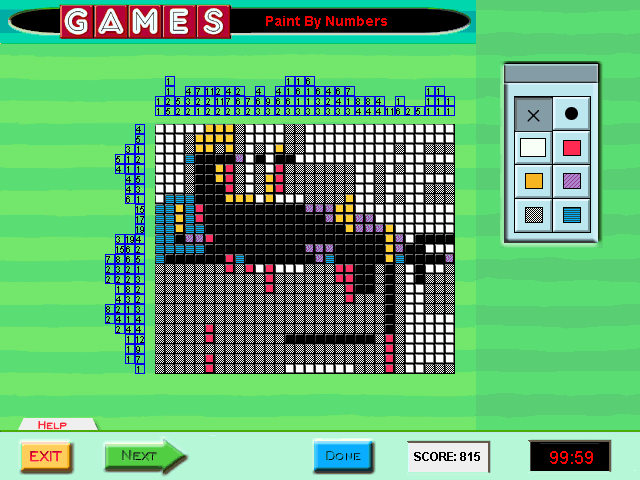 I’ve been sampling various puzzle types, but wound up spending most of my time on Paint By Numbers. This is Games Magazine’s name for the puzzle more often known as “Picross” or “Nonograms”. Games Magazine was one of the first publications to print nonograms in America — possibly the very first — so I don’t think they can be blamed for picking a nonstandard name. You’ve probably seen this puzzle type before, but just in case, here are the rules: A monochrome pixelated picture is encoded in terms of the runs of black tiles in every row and column. Thus, if a row is labeled “3”, then it contains three consecutive black tiles and all the other tiles are white, and if it’s labeled “3 8 5”, then it contains black tile runs of length 3, 8, and 5, in that order, all separated by at least one white tile. It’s a puzzle that gets a lot of mileage out of a simple ruleset.
Once again, the puzzles are grouped into sets that have to be solved together, even though each individual puzzle is quite substantial on its own. Solving an entire set is basically a full workday, and this weekend I’ve already done two of the four sets available. I think I’ll have to leave the rest to next weekend. I’ve found it easier to stay with these puzzles over a span of hours than I did with Battleships, possibly because the puzzles themselves give a stronger sense of internal progress. Solving them is a matter of laying visible foundations, which gradually turn into sensible structures. An isolated pixel becomes a line, a line becomes the stem of a flower.
The UI here could be better: it doesn’t recognize any sort of hold-and-drag, so every tile you want to set has to be clicked individually. It does, however, provide the one affordance I was wishing for in the Battleships puzzles: the ability to take notes on the grid. Although the solution is always entirely black-and-white, the game lets you draw in five other colors, just so you can mark the uncertain tiles in different ways. For example, I mostly used grey for areas where I had no ideas, red and orange for marking the possible extents of a specific run, and occasionally purple for shapes that I just wanted to try out to see if they worked.
There’s actually a sixth color you can mark tiles with, but it is vital that it never be used. That’s because it is exactly the same color as the white tiles. It just doesn’t count as white when the game evaluates your solution. How did a UI failure like this happen? My speculation is that at some point in development, the tiles defaulted to a color other than white. This would really have been better; as it is, I usually wind up coloring most of the grid grey anyway, tile by tile, click by click. If the game once had “white” and “default color” as distinct notions, that would explain why the UI has separate “white” and “erase” buttons. But, I speculate, at some point, probably late in the development process, a decision was made to make the grid start off white, just like it is in print, even though there was still this distinction between “white” and “default” internally and in the UI. This explanation is plausible to me because it seems like a lot of this game’s sins stem from adhering to how things were in print.
Given how misguided most of the creative decisions taken by the developers of this thing have been, I imagine ‘dragging it back to the way it was in print’ was a way for the client to try and salvage what should have been a slam dunk.