Heimdall: Inventory
 Comments(3)
 It sometimes happens that readers of this blog see me point out something interesting-sounding or overlooked about a game, and decide to play it for themselves. If anything in my writing has tempted you to play Heimdall, let me be clear that this is a seriously mediocre game. The lack of clear separation between quest-important inventory and ordinary RPG-level objects is just about the only interesting thing about it, the player’s attention is too often focused on coping with the user interface rather than on the game content, and, as foreshadowed by the character generation system, the game’s four main modes (sailing, dungeon exploration, combat, inventory) seem to all have been designed separately, without much consideration towards making a unified whole in either design or functionality.
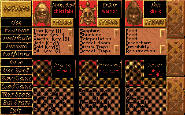 Let’s talk about the inventory interface a bit, because that’s the one mode that I haven’t described in detail. Actually, the game calls it the “options” interface, and it does indeed contain the save/load buttons, but personally, I think of an “options” interface as something external to gameplay, which this definitely is not. So I’ve gotten used to thinking of it as the inventory interface, because that’s what you use it for most of the time. I’ve spent a substantial fraction of my playtime just shuffling loot around among my characters’ limited inventory slots. Most of the scrolls I pick up, I discard after Heimdall identifies them, but before he can do that, he has to have them in his personal inventory, which often requires freeing up an inventory slot taken up by something else he just picked up. Possibly because he’s the one doing the fighting, Heimdall is always the first to pick things up, which means his is the first inventory to get clogged. Money stacks, as do keys (with a separate stack for each key type), so it’s efficient to give each stacking thing to a single person. I decided early on that I’d just keep them all in Heimdall’s inventory, so that they’d automatically stack when he picked them up and minimize the amount of shuffling needed. But the number of distinct key types grows over the course of the game, to the point where this approach may be backfiring: Heimdall doesn’t have many inventory slots left precisely because he’s loaded with keys.
One big problem the inventory interface has is a lack of feedback. There are no rollover effects of any kind to let you know what’s clickable — no highlighting, no changing text field, not even a change in the shape of the cursor. Perhaps this concept only gained traction with the advent of the web. Since web pages freely mix clickable text links with unclickable text, they have to provide as much feedback as they can, and indeed have provided all three of the mechanisms I just mentioned since day one. And yet, there still exist people who don’t understand hyperlinks, and who never click on a link that doesn’t explicitly say “Click here”. Such a person would be utterly lost in Heimdall. It takes some flailing at the beginning to figure out that the action buttons that require objects (such as “Use”) require the object to already be selected before they’ll do anything, especially since some of them still don’t do anything if applied to the wrong sort of object. It also takes a while to get used to the fact that “Give” is only used to give items to NPCs (an action I’ve only had to perform explicitly once in the entire game so far; usually they ask for what they want and you agree via a confirmation dialog), while swapping items within your party is done with “Distribute”.
The worst part is that the parts of the interface that look the most clickable — the word “Options” in the top left and the word “Items” attached to each character — aren’t. They’re on beveled plates that look like buttons, but they’re just title text. This may be a matter of modern expectations coloring things, though. I don’t know when beveling of UI elements was invented, but it certainly didn’t become a prominent part of the user experience until Windows 95.
Ultimately, all my complaints come down to the same thing: this is a game that expects you to read the manual in order to learn how to interact with it. This was a much more common assumption in the old days. I remember that time, and it wasn’t a good assumption then either. People have always treated the manual as a device of last resort. It just took the games industry a while to realize this, and to understand that the solution was to accommodate players, not to retrain them.
Yeah, this doesn’t sound like one of the games that I want to rush out and play.
I would always dig out and read the manual before ever playing a game. And then the manuals decayed into flimsy things with two pages of installation instructions needed only by the most computer illiterate and 8 pages of boring legalese and credits, and I stopped bothering.
[…] away to something beyond my experience as a then no longer so little boy. Although the charges on one writing that the game is mediocre in its design and that the player’s attention is more often focused […]